TYPOPOLO – a nostalgic Polish time capsule in the rhythm of disco
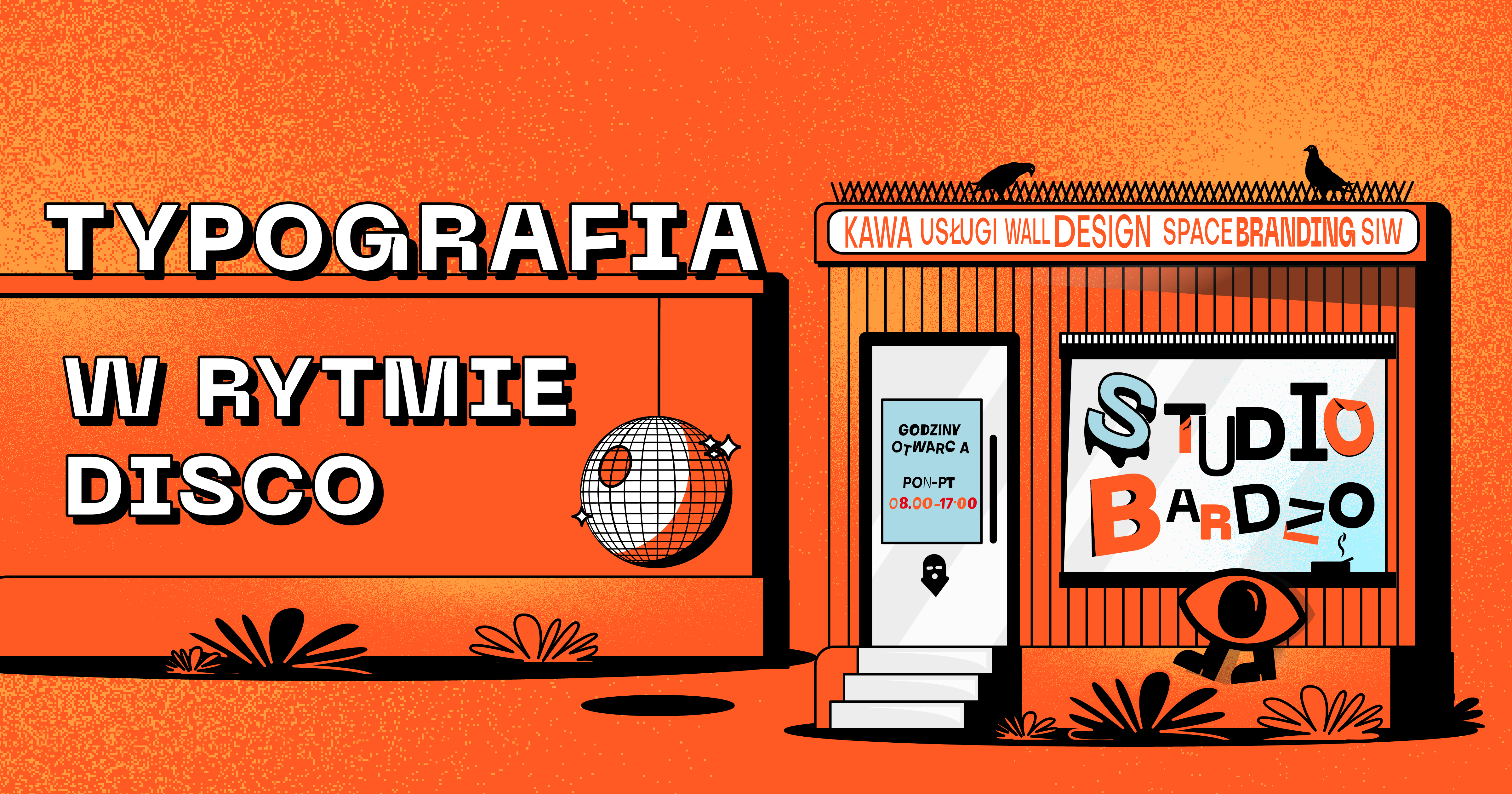
Whatever you need, whatever you want – there is no rule in TypoPolo
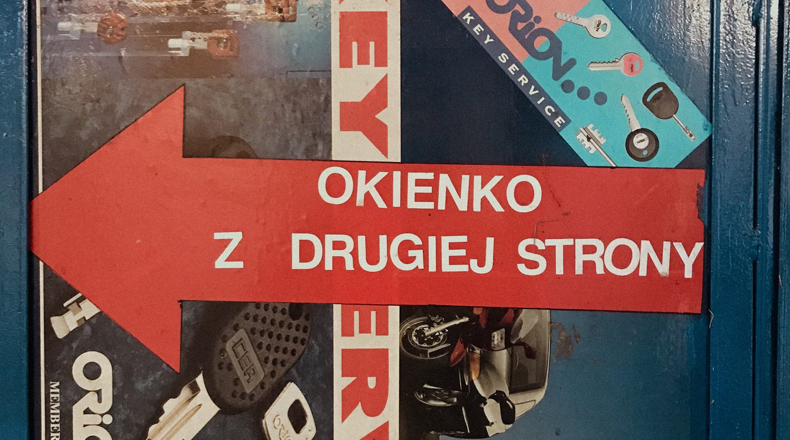
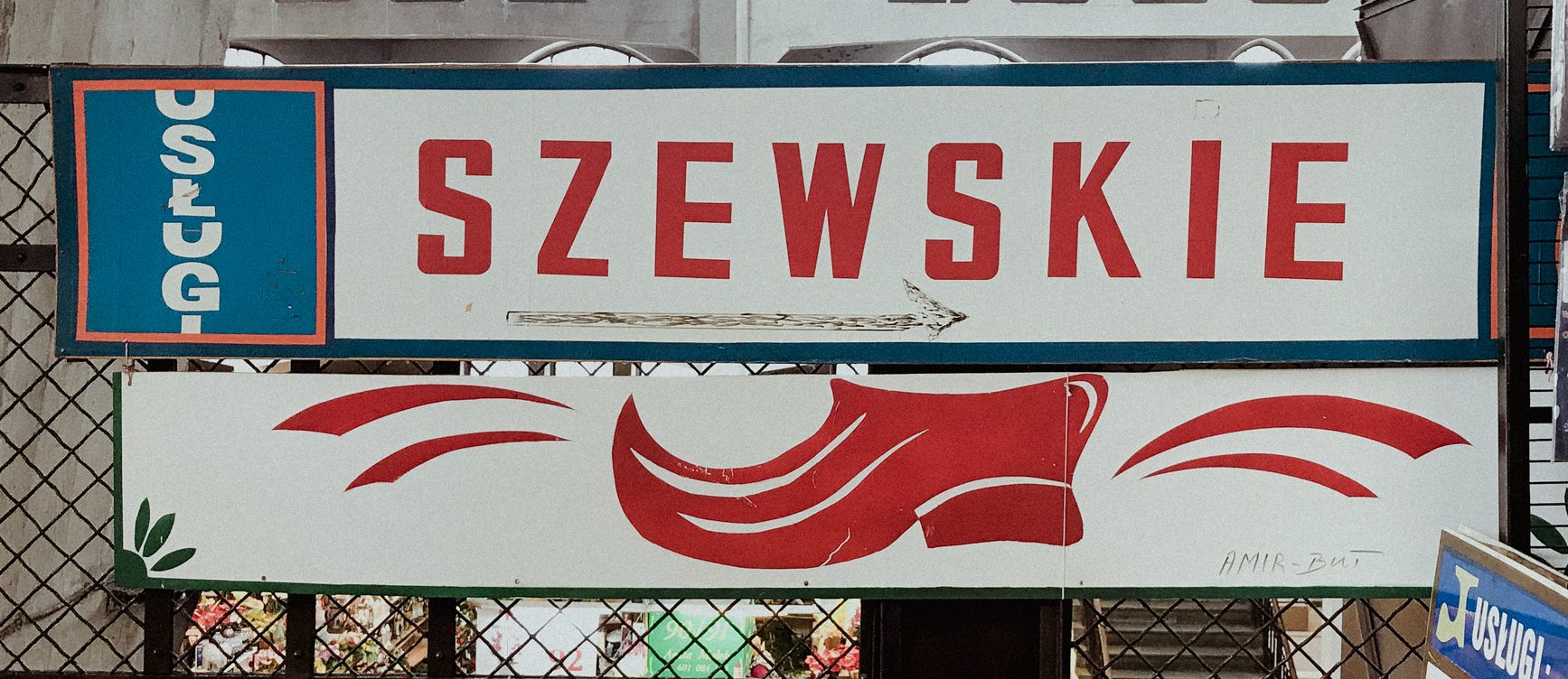
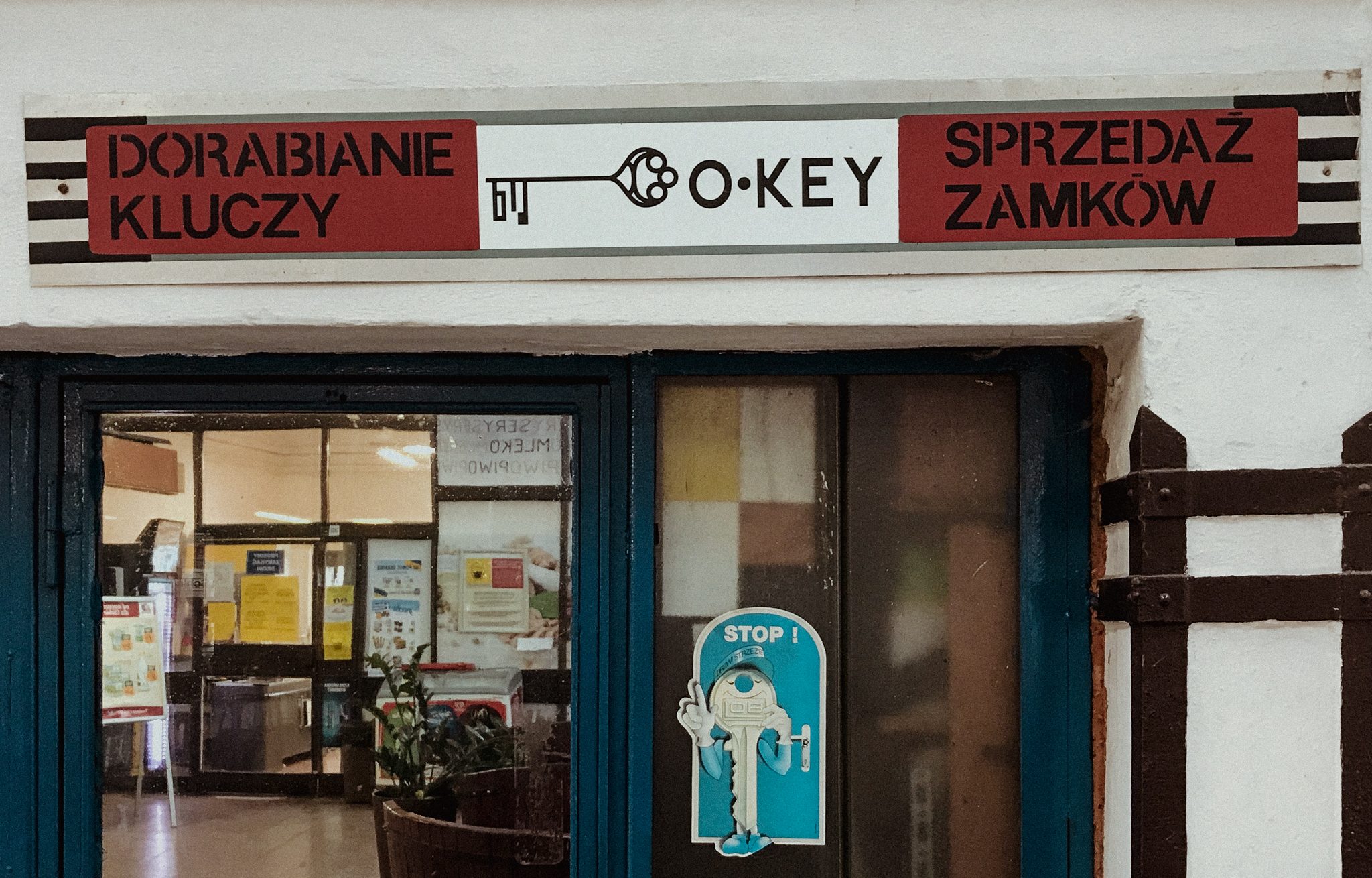
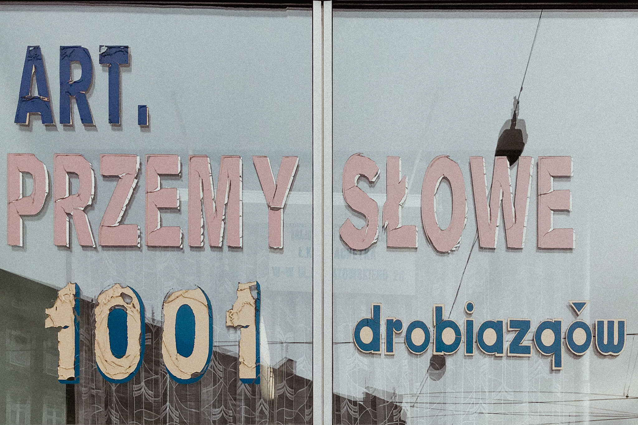
Let’s imagine the marketplace in Poland thirty years ago. The first things you can recognize are big, shouting, colorful and incoherent signs with names of products. Nothing was in the right order here, but it was not about typography design, but about trading. This is exactly TypoPolo typography art. It had no boundaries or rules. It was meant to serve its purpose for a small, thriving trade. Run out of eggs? We’d quickly cover the sign with something else and, yikes, we were selling milk.
The phenomenon of the 90s was the conviction that everyone can be who they wanted to be. It was a time of romantic changes, great transformation, a big step into the new millennium, where cars should have already been flying and robots should have taken over most sectors. This boldness can be seen in the handmade creations of signs, plates, and local craftsmanship. In Poland, it was a time of revival.
Disco Polo music has been labeled as kitsch by the Polish society, but also as fun and light-headedness. So has TypoPolo. Colorful signs, non-harmonious, asymmetrical word arrangements, haphazard typography art, lack of any rules or, going a step lower, coherence and consistency. A visual information system did not play any role here. A mish-mash, volcanoes of colors, a mixture of letter heights, lack of a well-thought-out layout – for many art lovers this is a real crime. Others see TypoPolo as a symbol of transformation, a testament to the changes that have taken place in space branding design since then.
Since you’ve been gone – how TypoPolo typography design has changed into a visual information system
TypoPolo hasn’t vanished together with Polish system transformation. It’s still alive on the streets. You can see those colorful and very brave signs, for example in Nadodrze in Wroclaw, where buildings remember the old times. However, it was largely replaced by professional space branding. The public was already overloaded with chaotic, incoming information and tired of misinformation. This insight was recognized by designers. The need to receive aesthetically pleasing, neat, and effective information became one of the factors that inspired the design community to develop a space branding agency branch. Luckily, disinformation and flashy banners of TypoPolo typography art were transformed into a coherent and clear visual information system.
TypoPolo – a symbol of transformation, evidence of change.
In the 1990s, Polish design grew in strength. Increased competition in the retail and service sectors led to the development of an advertising and customer courting market. It was the larger towns that started the real space branding design revolution. Navigation systems of cities were becoming orderly, uniform and legible for everyman. In the mid 90’s the first – and so far the only! – Polish subway appeared. Warsaw became famous in Poland for its underground transportation, not forgetting its solid and extensive visual information system. Its creators, Ryszard Bojar and Roman Duszek, had to rise to the challenge and take care of every recipient, at every underground station, at every exit, in every direction. The city’s infrastructure was followed by cultural institutions, office spaces, hospitals – places with large areas and constant interaction with the audience.
Why, then, was it easier to find oneself in a capital city or in a few-story building than in a marketplace we know so well? Society began to pay attention to signage systems and consciously look for specific, well-defined directions. There was no room for getting lost, searching for directions or answers. The development of infrastructure and digitization has also meant the development of access to information and space branding systems.
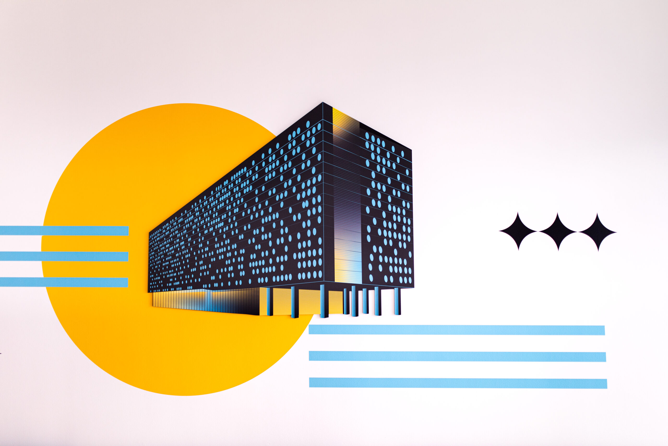
And that’s the part when Studio BARDZO appears with our design principles and beloved visual information system (you can read more about it here).
New design standards were created by replacing TypoPolo
for a visual information system
(Un)vicious circle of design - what does Polish branding from the 90’s teach us?
TypoPolo has become an inspiration for modern design. Designers draw on its lack of frameworks and rules to create equally uncompromising, sometimes slightly perverse and exaggerated creations. The TypoPolo typography art chaos has become the foundation for the creation of many typefaces that would have been perfect for the 90s marketplace.
Let’s talk about the magiel font, designed by Mateusz Machalski. The geometric letters were inspired by signs and plates taken straight from vegetable stores and small stores. They are intentionally full of various typography designs, breaking the rules of harmony and symmetry. This is not a neat and simple Helvetica, yet the mangle has become a popular retro font. It’s all about TypoPolo once again.
TypoPolo teaches uncompromising, slightly perverse and eye-popping design.
Visual information systems – why is it important?
Space branding design has become a coherent part of the space. Wayfinding and wall design have accustomed us to available aids and signposts so much that we unconsciously pull our heads out in search of directions. When we design wayfinding signage for a space, we take care of the viewer’s comfort and save them precious minutes. Imagine a long, empty corridor with no signage, no directions, no numbering or pictograms. A few empty floors and only you, looking for one particular room. Long minutes of blind wandering guaranteed. The only thing missing in this labyrinth is a mythical minotaur, but where is Ariadna for the rescue?
We create space branding design that takes care of your well-being. We adapt space to the mission, vision, and values of your company or institution. Through a visual information system tailored to the industry, we increase brand awareness among employees and clients. We design a good experience for those who come into contact with the company. We strengthen the relationship with the brand and above all, we care for their sense of security and orientation. A person entering the premises and guided by branded and understandable messages creates positive associations with the company.
We combine the need for information with good design. We create communication between space and its user. And suddenly, the walls have ears!, because they listen to the needs of the user, and show them exactly what they need. They showroom numbers, directions to the exit, the elevator, or the way to the conference room. They help drivers find exit underground garages and shoppers locate toilets in galleries.
We paint murals, cut out signs, and create boards. We sculpt, cut, but above all, we inform and raise brand awareness. We navigate, we point the way, and we do it all in a way that is consistent with the company and with design flair. And TypoPolo is our reminder that design has no borders and local culture is a source of inspiration.