Keep up! Visual information system - a way that leads to the point
Public and office buildings, hospital giants, apartment buildings, extensive commercial spaces… making these facilities passable to lead users intuitively to the right places – this is the part of our mission hidden under the Visual information system. We care to make it clear, readable, unobtrusive, and consistent with the brand way. This way the user won’t get lost and will know where he is and where he should go.
The space we trust
We like to compare creating multi-floor office space branding to creating an amusement park scenography. Besides the spectacular final effect, improvements such as toilets or bins locations matter too. You can ask: why? Well, good user experience means not only satisfaction from the product or service. Most of all, the users’ safety is achieved by well-oriented and well-organized conditions with our client in mind. How can you create all of it in a corporate building? The answer is simple. With creating visual information systems.
The closer to people, the better.
Supervision which leads you. Also to the profit.
Have you ever played treasure seeking? Do you remember creating a map with all of the directions, drawings, and colors? If you draw the map well, the treasure was easily found. They’re the same rules when it comes to well-designed visual information systems, if pictograms, signfboards, and building plans are supported by signposts and landmarks organizing movement inside the building. Then, even if you don’t know the way, you are confident to reach the place you want. No matter if you are a client or an employee, with readable office space branding, finding the elevators, main hall, or bike parking is not a problem.
Effective communication between each floor and rooms is one of the factors providing smooth movement, and so the comfort of actions. This is how you can skyrocket the quality of offices, hotels, shopping malls, or clinics just the same way as through innovative equipment.
Advantages of a user-tailored visual information system? Ergonomics of work, and a prospect that the space will be user-friendly.
Wayfinding as Ariadne’s thread myth – find the way out.
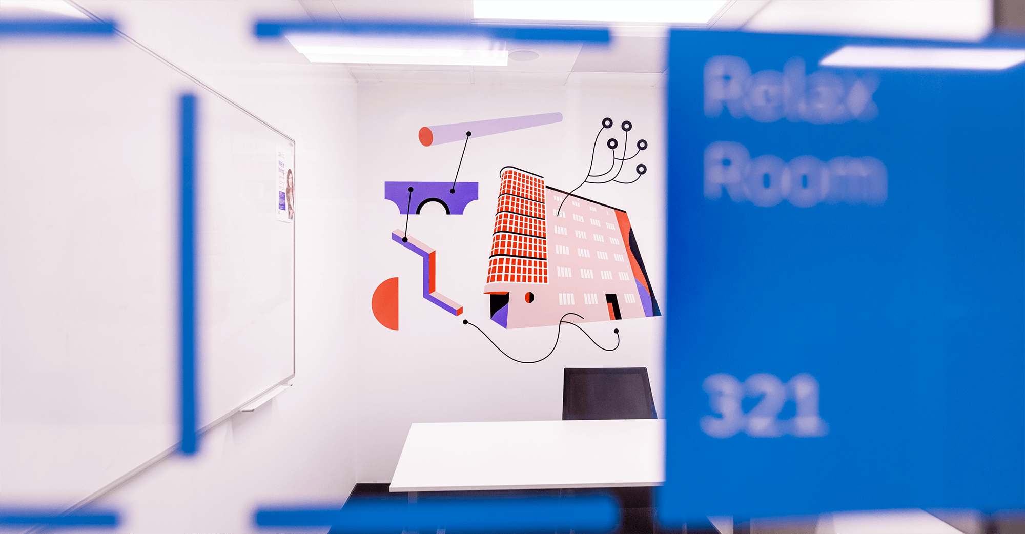
When do you become a user of signage design and wayfinding system? Well, when you get out from the elevator or staircase and you can already see exactly on which floor you are. When you have no doubts about which way to take to a conference room, cafe, ATM, or carwash. When you are at a museum, walking the path of history thanks to directions and signboards. Or when you are in a hurry, running to your train, or need an escape route.
Estates need the same useful wayfinding design. In order for visual information to provide clear, precise instructions and reliably lead to the destination, they have to be created as a coordinated system – without dead ends or broken communication routes. If you don’t believe us, ask the delivery man 🙂
While designing an estate’s navigation system, we’re aware of creating understandable communication. What other things should be marked except numbers of houses, apartment numbering schedules? Ways to a garage, storage rooms, bins, or car parks’ drives – it all matters, and we know it. So does a readable sign system of services, playgrounds, bicycle and stroller rooms, sports fields, or bike paths. Marking all of this in estate space allows new residents and city visitors to get their bearings and find the way easily.
There are principal rules of how we can explain the way in particular space. Additional information, transformed into an orderly, legible, and universal visual language, is essential.
Pushing urban sensitivity to the edge
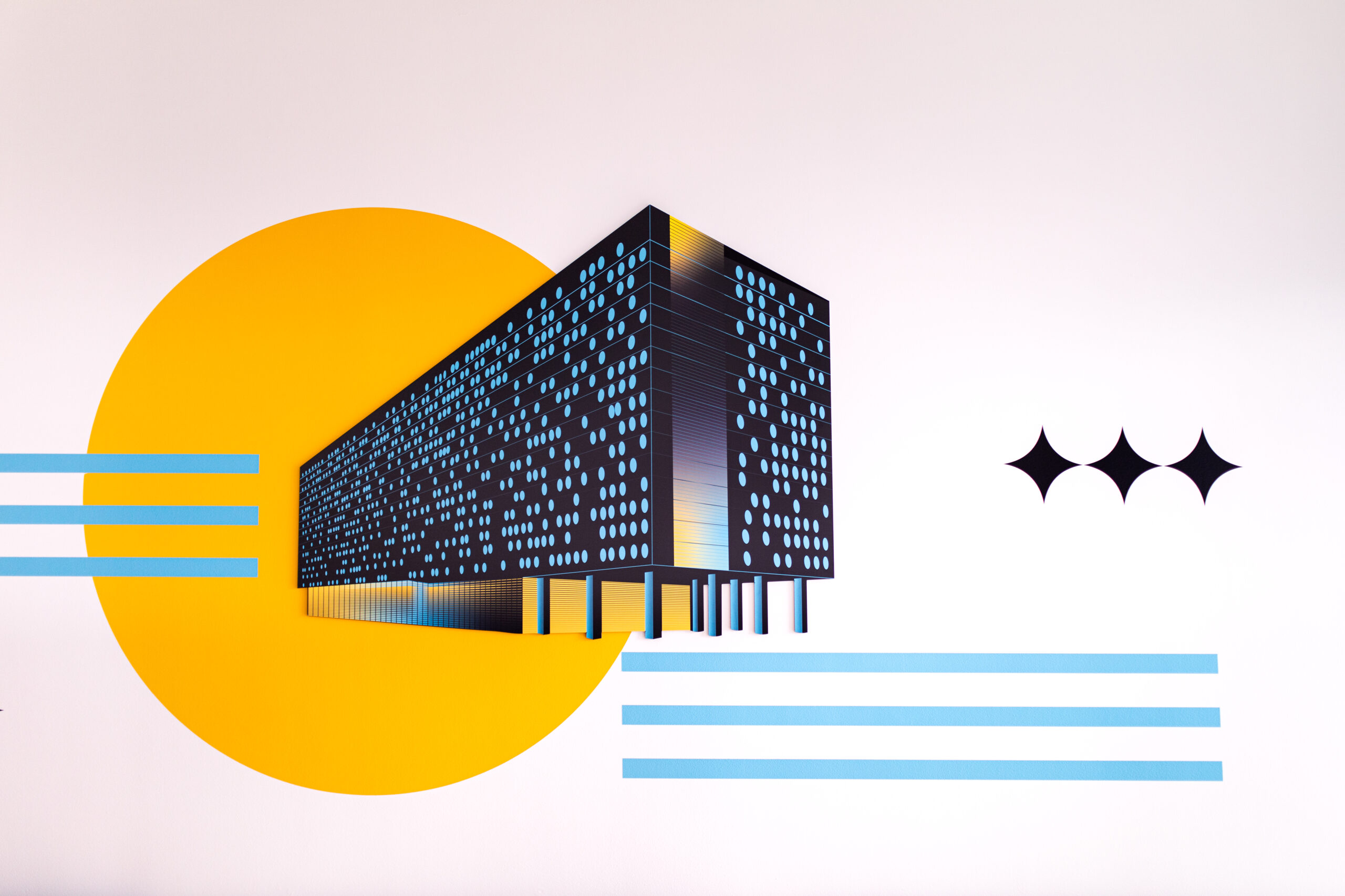
The process of creating the wayfinding design means not only navigation but also a reinterpretation of the space we’re working on. Everything begins with architecture and everything is connected to the place’s soul. Due to that, we like to expose information with signboards, colors, marks on the walls, or spatial forms and reliefs referring to the building’s style and history. We look for a combination of colors and symbols, which empowers the message, emphasizes the context, and highlights the space. The clue is to create a wayfinding design which will be simultaneously visible and blended into the surroundings when giving clear tips about the users’ and strategic points’ location.

Wayfinding design with no limits and no exclusion
Summing up our essay about a visual information system, let’s talk about one more factor influencing utility – universal accessibility. If we don’t match the space communication to all different users (kids, seniors, people with motoric disabilities, or with poor eyesight), we will let in dysfunctional oversights. Let’s remember about verbal messages in elevators, about maps with special factories allowing blind people to read the signs with fingers. We use clear colors and scaled markings to distinguish between floors. This awareness of challenges in using the space and services can save you from obstacles and will bring benefits such as sharing the territory. As our job is also, and mostly, a creating process with an analysis of space and empathetic action, we guard the visual coherence, simplicity, and brevity of the message.
And that’s why we love this job to the moon and back!