Jak projektować space branding, żeby pracownicy działali na pełnym flow? CASE STUDY
City architecture as part of design language
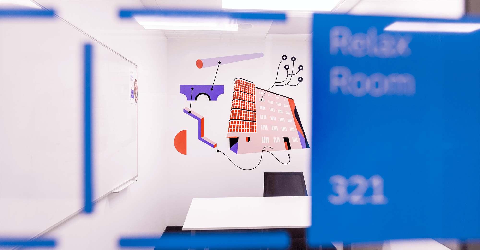
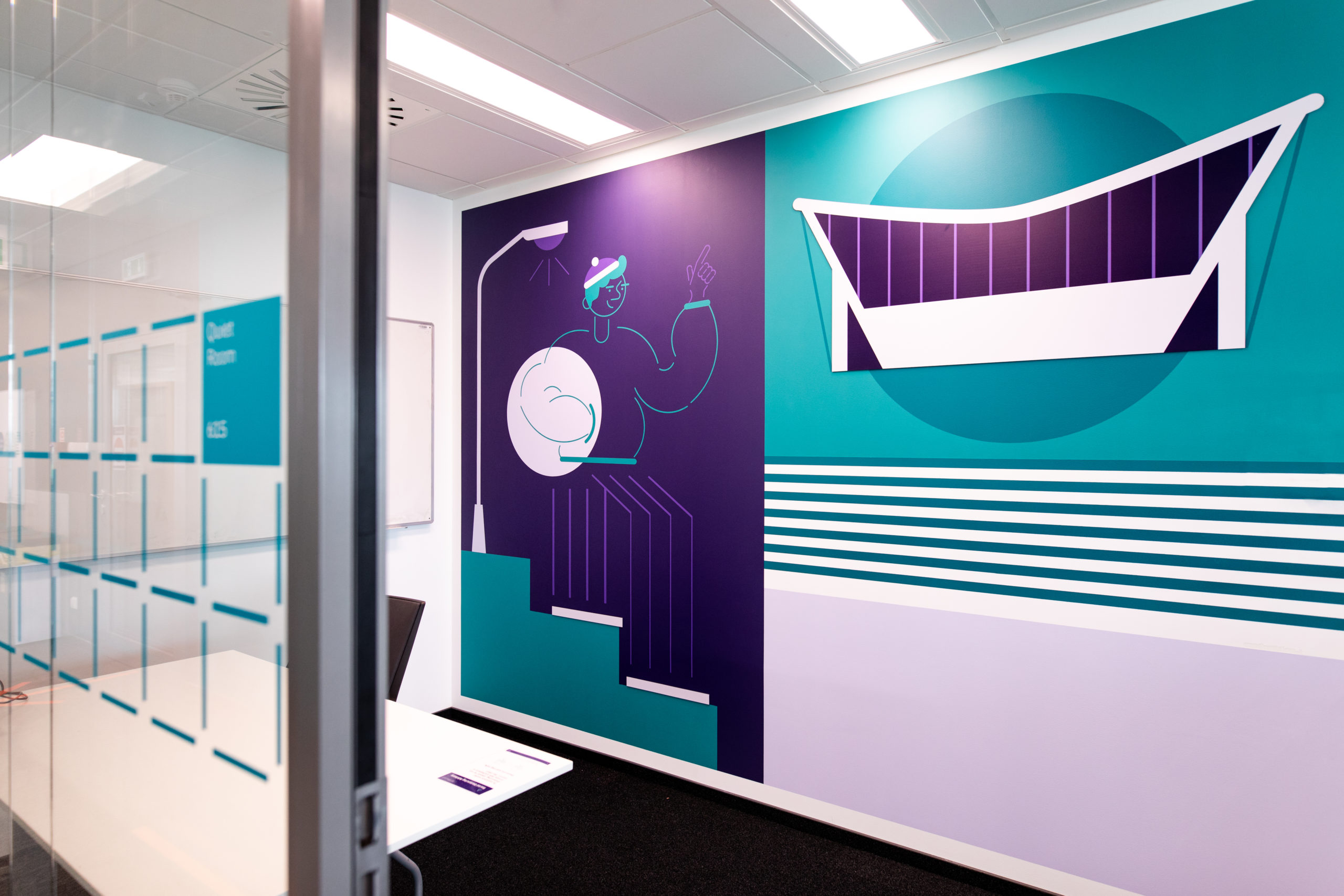
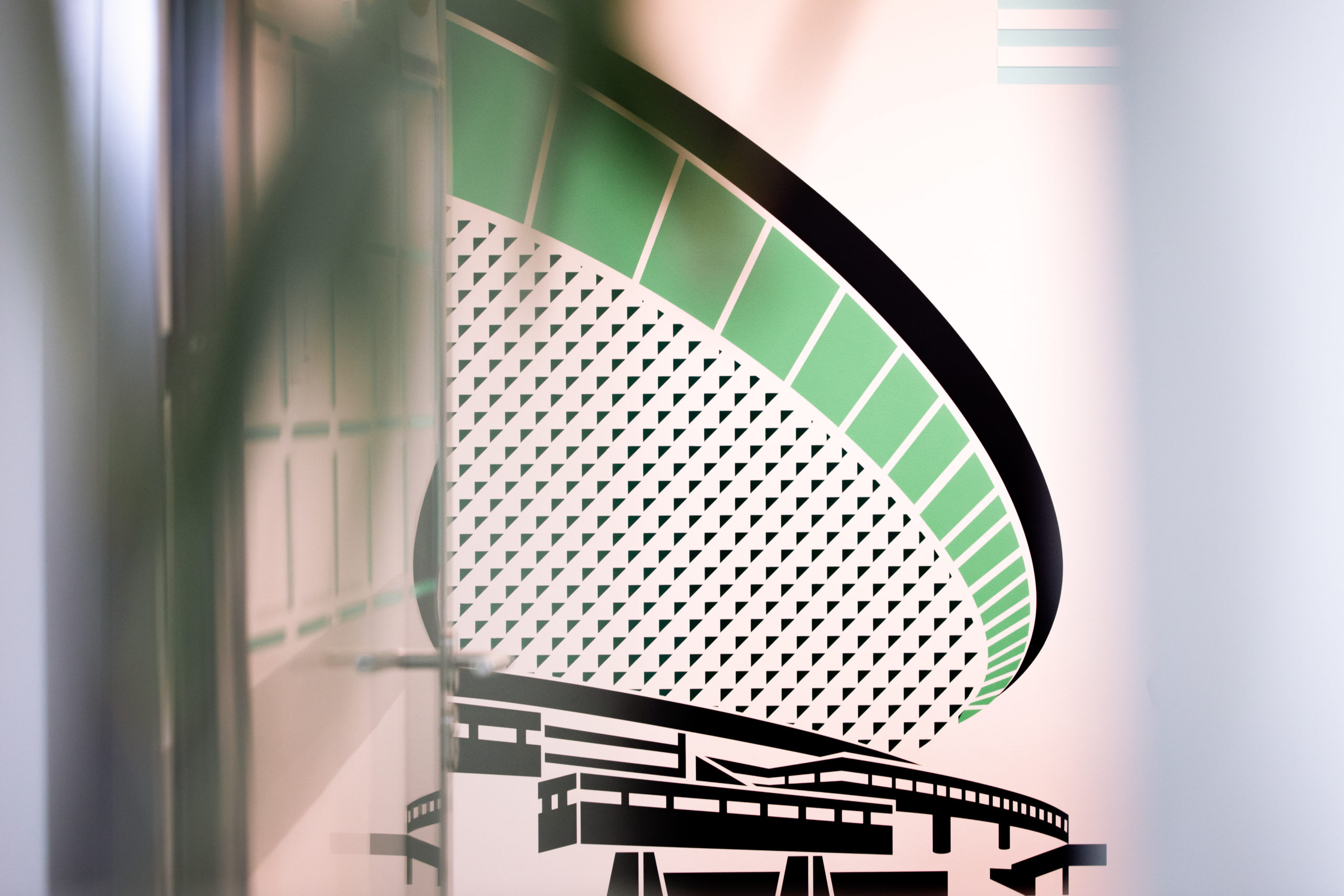
Hired by 3XA architecture studio, we have designed a brand new visual identity system in a 7-floor building located in a Polish city, Katowice. What was our goal? To combine the visual identity system with creative wall design for office and graphics consistent with company branding. To do that, we’ve studied the visual identity manual from cover to cover and got familiar with the local environment and culture. That’s how we’ve managed to design office space architecture which inspires and awakens creativity. A GPS system, developed by us, guides you through all the 7 floors full of Silesian architecture legacy which was the principal inspiration and base of our artists’ work.
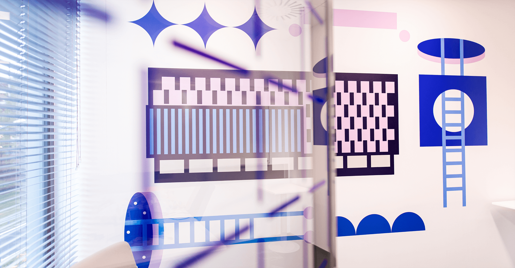
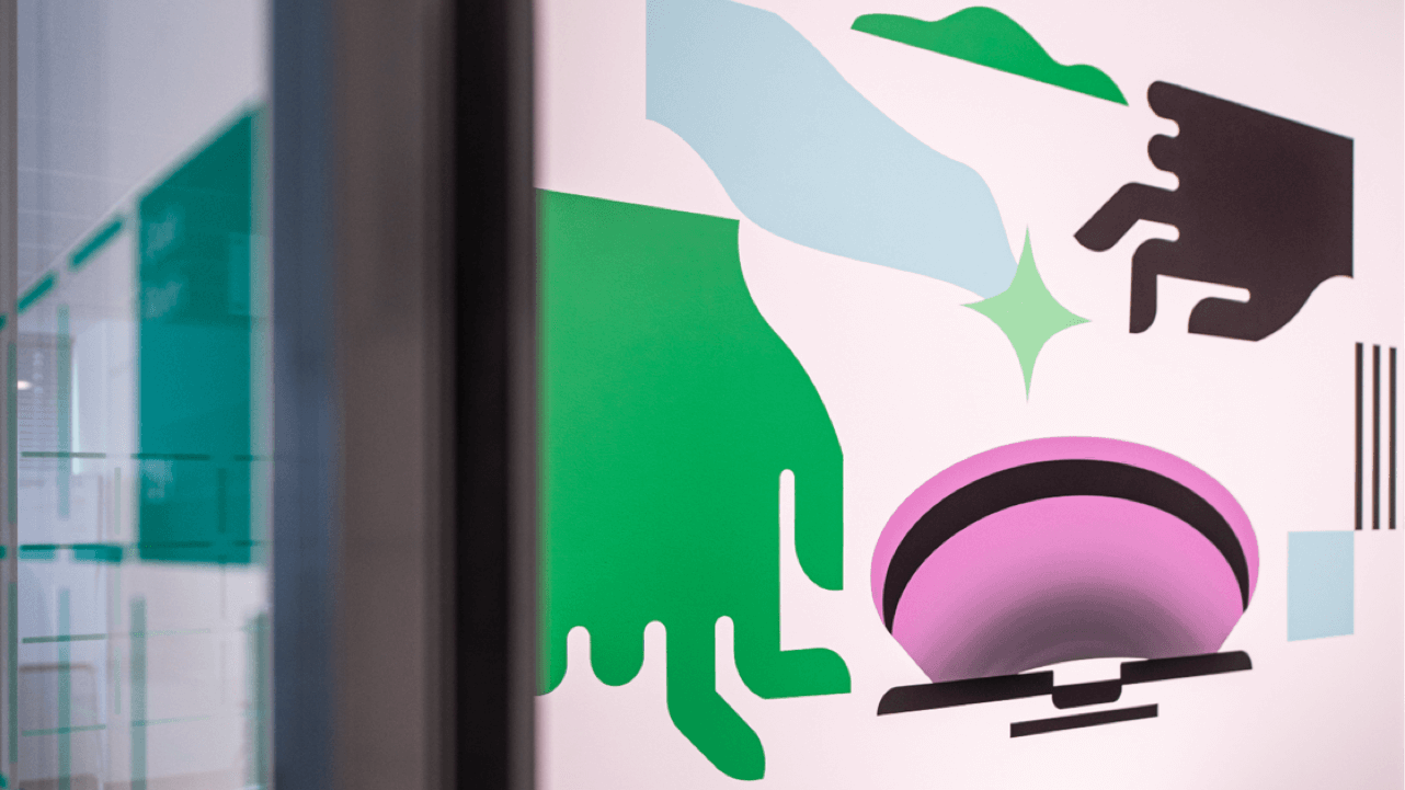
Shapes imitating the icons included in the visual identity manual, geometric illustrations mapping the architecture of Katowice, and our original graphics which intend to create intriguing optical effects when combined with lights – that’s the essence of this office space branding project.
Changing the faulty navigation and vague walls? – challenge accepted!
Right after we see the interiors, and their condition of course, we may estimate how challenging the project will be. Here, long and empty corridors, elevator halls with white walls full of roll-ups were too vague, too anonymous, like in a cold hospital building. How to make office space architecture better and readable for users (in this case IBM’s employees)? We had to replace illegible floor markings, chaotic office tagging, a growing number of information boards, with a coherent design system showing all locations in the building. Our wall design ideas aimed to prevent the user from getting lost or misinformed. Conference rooms? Toilets? You will get there with no doubts and spare questions. 🙂
A customer need chain – how we organize cooperation from scratch
Before starting to design the new space branding system, we had to figure out how employees, clients, repair crew – basically all users, will be moving in the building. Moreover, we needed to take into consideration expectations of the building owner or general contractors as well as suppliers’ possibilities. Last but not least, the architectural vision was very important for us.
Achieving those goals involved creative briefs,business trips, local vision, consultations, negotiations, brainstorming, working out the space branding ideas, creating a budget spreadsheet, and team building process. Sounds like a lot of work, right? It really is, and half of it is invisible for our users. However, without those internal steps, not a single person could make a step forward. We take into account all these determinants in our process. It quickly, but not surprisingly, turns out that we are not only artists, but also strategic business partners.
Truffles-seeking, or where we get our inspiration from
Organization stage is done, so it’s time to begin the design process steps. We focus on what visually defines the company and its building. The first stage of design process is the analysis of the logo. In this particular case we knew that the logo had been made by world-famous names of branding so obviously we decided to seek inspiration there. It resulted in putting the most unique graphics elements from the visual identity manual on the design grid. We used it also as a core of the visual identity system in wall design ideas, which is necessary when each floor is designed by a different architect in a team. The design grid was also a template for creating graphics based on proportions and lines of logo. Studying the guidelines, noticing the lines, the shapes, we’ve made it! The perfect touchpoint was clear in our head: the city architecture, a typical modernist geometric block with a strip arrangement of windows.
How to design space branding which will take your employees’ work to the next level?
How to design space branding which will take your employees' work to the next level?
For illustrations, we chose objects that at one time clearly represented the idea of functionality and progress by imitation of rocket structures, transatlantic ships or even spacecraft. 🙂 And that is why our graphics obviously! presented the most legendary and significant buildings of Katowice such as Spodek, main station, trading houses, including Zenit or Skarbek, the Silesian House of Press, and famous residential area Gwiazdowce. The former and latters are all elements of space architecture with a light surface and with cubist touch. Raws of large windows, flat roofs, box-like constructions without unnecessary ornaments simply shows the energy and spirit of the town. And where is the place for IBM’s building? All of the above goes with the spirit of the IT world – with its analytic perspective and search for multifunctional and simultaneously compact solutions.
Teamwork makes the dream work. Team Building as we like – at the drawing board
There are so many ways of creating the graphics, signs… Whatever shows up in our heads can be a potential idea. How to find the key to the visual identity manual for 7 floors? We’ve decided to divide floors and mark them with different colors. For each level, we developed the wall design ideas using one of the colors selected from the client’s palette, and we randomly assigned floors to our designers giving them the task of matching their own graphics to a given space. Coherence of our creators’ vision? Well, we weren’t worried about that at all… 🙂
Wayfinding signage – Walk in the clouds
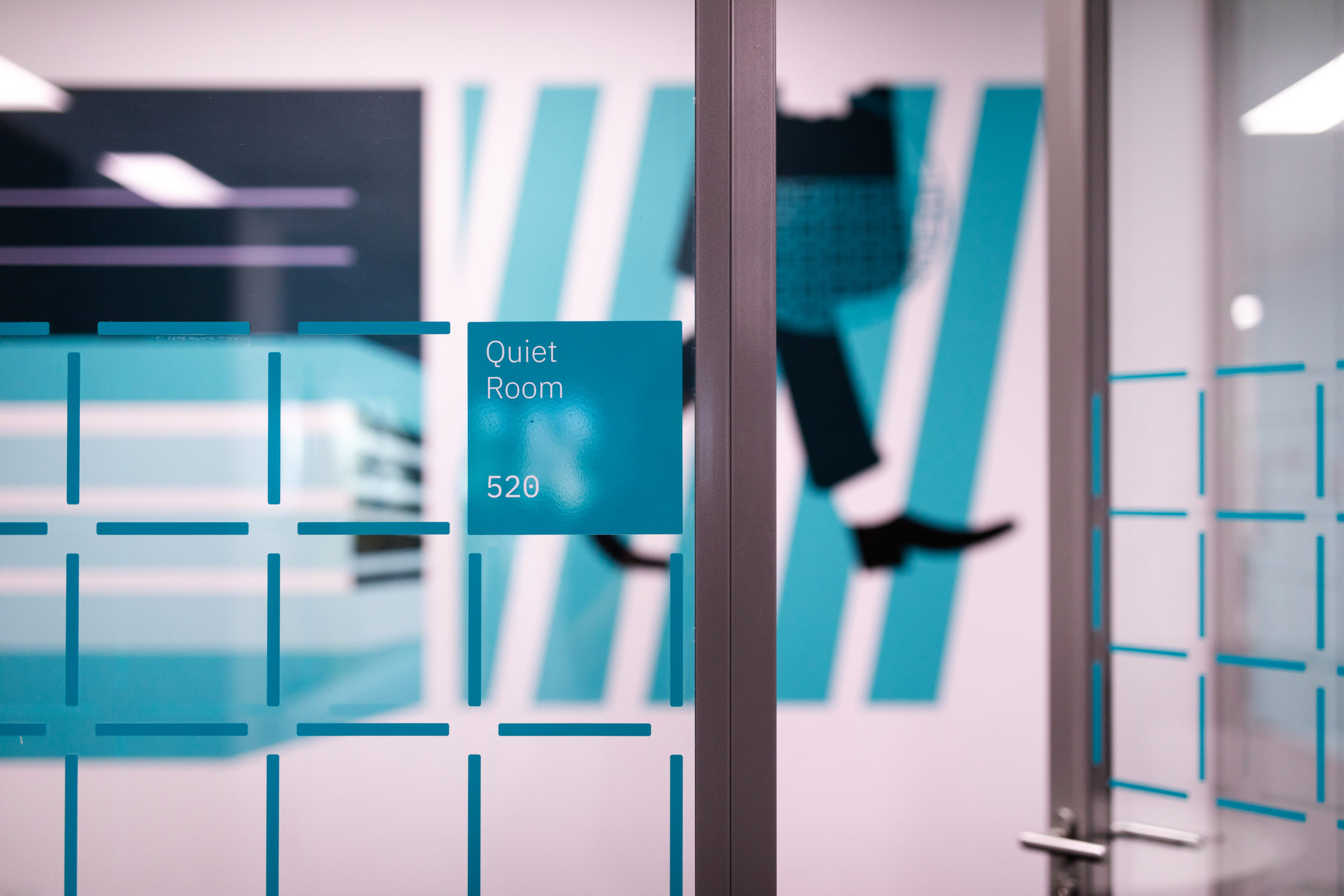
Imagine a huge 7-floor birthday cake with every layer in a different color suggesting its flavor. Our wayfinding signs work the same. Let’s take a walk. First, we visit the reception and ground floor, which are white and blue. Why did we choose exactly those colors? Those are the main colors of the visual identity manual, but we also added some spice here by inserting some red accents. From the 3rd to the 7th floor we implemented the same elements in similar places to emphasize the path scheme and facilitate orientation for users. We bet on gray corridors with brand posters, but for corner walls we used the color of each floor with ABC signs and graphics consistent with the color themes.
Simplicity is the key. When simple, the dominant elements of the space design system empower the design. But the real power lies in the combination. The tiny elements,only when put together, build wellbeing and ergonomy.
Dream big or go home. Implementation of all media.
Every project, even the seemingly perfect one, may be impoverished by poor-quality or inadequate materials. To avoid that, we have a secret weapon – our realization, which we pimp up to the bitter end. All graphic details are saved as production files (ready to print or plotter cut). Thanks to this method we’ve created templates which were then used by executive painters who painted the icons of silesian architecture on the walls. Our next move was adding foil and UV printed elements to the glazed, and regular walls. After that, the fun part! – installation of spatial letters made of matte black plexiglass. Mixing all the different methods of printing is our secret way of providing a variety of textures, which gives a successful visual identity manual in the end. This is how we create an intriguing and extrasensory space branding project.
Playground time – creating a space branding
Every space arrangement idea fascinates only when it’s properly put into use. So first of all: diligence and prediction of material interaction! This office space branding project required precision in every single element of typography. How can you be sure that letters won’t tilt? We made them with a lot of love: firstly, every letter was measured with a laser level and laser cut from a matte black plexiglass plate. When attaching the letters to the wall, we used a template that shows the coordinates of the element. Then the montage glue and the double-sided tapes entered the game, so as not to be surprised if, while drying, the letters rolled down a bit. Wall design graphics in offset printing have been supplemented with spatial, colorful shapes made of a sandwich slab, precisely cut with a milling machine. Placed close together, they composed a 3D effect on the walls by contrasting with their gloss and protrusion with a dull, flat environment. As the motif of the window cover, we used a repeating characteristic net pattern and unidentified fancy shapes. We placed them in such a way that they optically intensify the illusion of flying particles in the air. Guess from what code 🙂
Interiors and employer branding – a win-win situation
The final look is the product of high customer awareness and a green light for our designers’, sometimes crazy, inspirations. And for us this was a win-win situation! We were able to experiment artistically, show our design spirits and thus, create an energetic work ecosystem in a given space. After our artistic intervention, the office has burst with life and willingness to create. We managed to awaken what had fallen asleep. The office space branding project was based on a visual identity manual but also on the modern culture of Katowice and Silesia. We believe this is how brand gets unified image and stands out in the crowd.